|
We follow Jacob Nielson's publications closely for changes in the trends of the web. He is a well known web design usability expert. In addition, we follow WCAG (Web Content Accessibility Guidelines) as close as possible.
Below, we highlight a few of the usability and accessibility practices we adopt for all of the sites we do.
1) |
Search Engine Optimization (SEO)
We design our sites to be friendly to search engines such as Google, Yahoo Search and Bing. All our web design packages comes included with search engine optimisation to maximize your site's web exposure.
Please note that we do not guarantee a #1 listing or a first page appearance. Ranking depends on many factors. The major factors are link popularity and content originality.
After all, if any Tom, Dick or Harry wants the top spot for a particular keyword, how do the search engines decide whom to give the top spot to? Read Google's take on SEO. You may also want to check out our standalone Search Engine Optimization service for advanced SEO. By being open with how we optimize your site, you can be assured our practices are legal and will not land your site into trouble.
WARNING: Be wary of companies promising #1 top spot for search results. Your site can even be banned by a search engine for fraudulent practices.
|
2) |
Making use of the whole browser width
Our websites are designed to fit into the available screen width. No matter how high the resolution of your display is, the website will auto adjust its contents to fit into the available browser space.
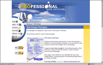
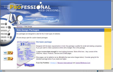
Compare:

Fixed Design - the site centers on the screen

Liquid Design - making full use of screen estate
Widely known as "liquid design", it is a popular accessibility feature that allows users with high resolution monitors to make full use of the available screen space.
As you can see in the second screen shot above, our site automatically fills in all available space in the browser. Try it yourself! Resize this browser window and you will see the design and text automatically reflow.
|
3)

|
Resizable Fonts
Have you ever been to a site where IE's Text-Size (Menu Bar > View > Text Size) feature does not work? Annoying, isn't it?
The pages we do are designed to allow text resizing. It is a widely requested accessibility feature that assists users with high resolution monitors.
|
4) |
Non-JavaScript Tolerant Design
We test our websites with many stringent tests. One of them is accessing your site with JavaScript disabled. JavaScript is a scripting technology used in web pages to greatly enhance the interactivity of the site.
However, some users disable it for security reasons. Many websites rely so heavily on JavaScript that the website does not function properly when a user disables JavaScript. For example, Twitter will refuse to show any page with JavaScript disabled.
We ensure that the websites we design are still accessible to such users.
|
5) |
Image Tool Tips
Tool tips are text that appears when you leave your mouse pointer over an image. Try it on the image below

If you mouse-over the image, you should get a tool tip
We add tool tips to images that we insert into your site. This plays a strong role in usability as well as helping in search engine optimization.
|
6) |
Consistent and Standard Formatted Web Pages
Every page follows a consistent layout with standard headings, links and colours.

Consistent layout among our web design pages
|
7) |
Anti-Harvest E-Mail Protection
All our packages come provided with a free e-mail feedback form facility. However, some of our clients request to display the e-mail address for easier e-mailing.
The problem with this is that spammers deploy computers that scour the web with e-mail addresses displayed openly. These computers add the e-mail address they find to a spam list.
The next thing you know, the mailbox for that address gets lots of unsolicited mail.
We work around this by encoding the e-mail addresses in JavaScript which can only be readable by browsers. Such a method is not 100% fool proof, but is better than displaying the e-mail address openly.
|
8) |
Minimum 800 x 600 Resolution Design
Though many statistics from the US recommend 1024 x 768, they are mostly based in the US. In Singapore, most of the computers - especially government and corporate users - still use 800 x 600.
However, as noted in (2) above, the designs will automatically accommodate to fill in the available high space for high resolution users - giving a win-win.
|
9) |
Readable Font Sizes
Small fonts. Many of us hate it. We call it the negative Web 2.0 effect. Designers simply love to use 8pt font sizes, sometimes even breaking the browser's font size accessibility feature.
Visitors tend to leave the site on having to lean close to their monitors to read the microscopic fonts.
In our designs, we set a font size that is at least 0.8em, or about 12pt. Even our usability guru Jakob Neilson has an standalone article on this.
|
As you can see, we place high emphasis on the usability of a website. Explore our portfolio for samples of some sites we have done.
|


