Home > Future Design Plans 2003
Future Design Plans 2003
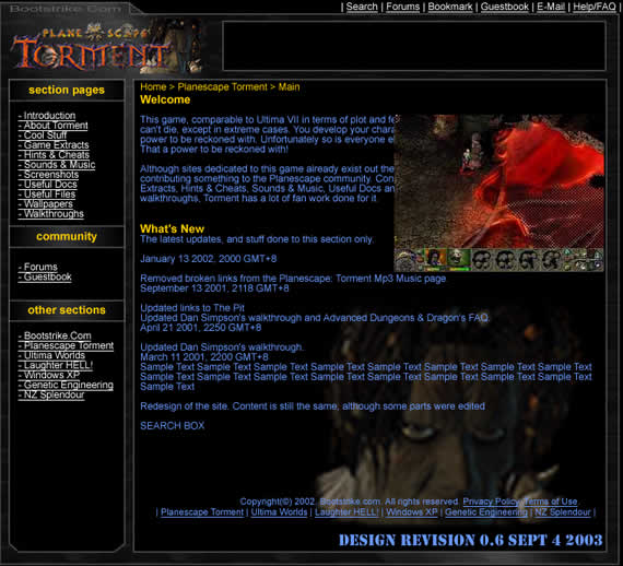
One year has passed so fast since the Bootstrike.Com design was implemented. The site has went through many enhancements to the design including changing the top right image and organisation of the navigation links.
Design Preview

Please give your comments/complaints. Here are my initial ideas on what the new design is going to incorporate.
- Moving the whole website to CSS - older browsers will face a problem, but this will affect only a small percentage of the visitors
- Moving main section links to the left
- Reducing the size of the header as it is too big and slows down the download of the page
- Removing the background image
- Changing the left navigation layout to a permanent stretch
- Making font size IE friendly so that it responds to IE's Text Size command
- Copyright notices to be part of content (within site borders)
- Background fixed image of the main character of the section
Your comments WANTED!
Comments Received
- My opinion is ... YEAH MAN GO FOR IT!
- My opinion is ...The page is kinda dark looking. I like the more "streamlined" look, but perhaps some more reds to contrast the large amount of black that is present on the page? Also, I have to comment on the loss of my favorite quote "What can change the nature of a man"? There has to be somplace on the new layout where those infamous words can be emblazoned, right? (Yep, I'll see how I can squeeze that -Ganesh)
