Top 5 Mistakes Software Developers Make
Version 0.51
Many programmers make these user interface (UI) usability errors for their programs which I keep seeing more of.
This is a top 5 list of common usability problems I encounter with modern day applications.
5. The No-Skins Classic View
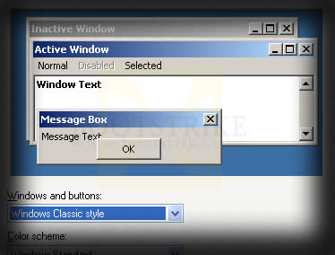
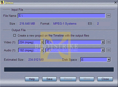
Skins are cool. Office 2003 UI is cool. But some skins make it very hard to read the text. Especially those textured backgrounds, here's an example.
MPEG Video Wizard DVD Demux ScreenRather than following the standard windows color scheme, the designer forces users to adhere to their chosen colors.
With the dark colored blue background and textured background, users with low contrast monitors will have trouble reading the text.But I just want the Classic View, thank you very much! No Skins, just the standard Windows Classic look!
4. Don't put items to start-up automatically
If you need your program to start up automatically on every login, ASK! If the program needs it in order to run, then run it WHEN your program starts and TERMINATE it when your program is done. Even if it slows down the program start-up or closing, I am fine with it.
Don't think everyone wants your program to run in the background for 'instanteous launch' or convenience purposes when I am going to end up using it only once per month. It takes up RAM and unnecessary CPU cycles as well.
3. Allow a user to pause a activity
When a program starts writing sequential data to the hard disk, any other program that requires I/O access slows down the entire system as the hard disk has to move its header to and fro two locations.
A pause button that allows the user to pause the writing activity and perform the other I/O request avoids this issue. Without it, the user has to avoid doing any task that may require lots of I/O activity while a program is busy writing to the hard disk.
For example, MPEG VCR, a video editing program, comes with a thoughful feature of a Pause button whenever a file is being saved.
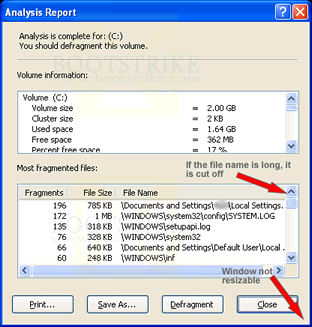
2. If you use a ListView control, make sure it is resizable
Windows Defragmenter is known for this. One way is to double-click on the column line at the end of the column heading to automatically fit the column to content, but that still requires knowledge of such a feature.
If you are using such a means to display data, allow the window to resize and ensure the listview stretches to fill the available space.
1. Stealing Focus
Don't EVER EVER EVER steal focus no matter how urgent your request might be. Okay, if you really need my attention, make your window come to the top but DON'T steal focus.
Imagine I am filling in a form on a web page and your software springs a dialog box in front at the point where I am about to hit Enter. What happens? I dismiss the box without myself knowing and am left to wonder what I could have missed or accepted.
Do you have more to share? Comment below!
Last Updated 24th September 2008.
Errors? Omissions? Need Help? Know something? Post your queries in the comments below.
This document is Copyright(©) 2001-2008 by G.Ganesh. Visit Bootstrike.Com (http://bootstrike.com).


2 comments